
The short answer
Fix what happens to the visitors you already get before you pay for more. In order: make the first screen say what you do, who it’s for and what to do next; make it easy to call or write from a phone; and put real proof where people hesitate. Then check that the page is fast on a phone, and that someone answers when an inquiry comes in.
If you read nothing else, run these eight tests. Each one has its own section further down.
| Fix | The test | What good looks like |
|---|---|---|
| First screen | Show your homepage to a stranger for 10 seconds. | They can say what you do, who it’s for and what to do next. |
| Next step | Read the main button’s label out loud. | It says what happens: “Get a quote,” “Book a call.” |
| Phone number | Tap it on three pages, on your phone. | It opens the dialer every time. |
| Form | Fill it in on your phone, with one thumb. | Only what you need before a first conversation, and it arrives. |
| Proof | Look beside each service and each button. | Real work, real names, a link to your outside reviews. |
| Answers | Find your five most-asked questions on the site. | Each answer within two taps. |
| Speed | Run PageSpeed Insights on mobile. | Main content within 2.5 seconds, and nothing jumps. |
| Reply | Send yourself an inquiry. | A real reply the same day, and sooner when you can. |
Does your first screen say what you do?
It has to. In one eyetracking study of 120 people on desktop, more than half their viewing time went to the first screen, before any scrolling.1 And they’re quick about it: people often leave within 10 to 20 seconds unless they quickly see why to stay.2
Share of viewing time on a page: 57% went to the first screen, and 74% to the first two screens.
That’s your window, and the first screen has three jobs in it: say what you do, say who it’s for, and show the one thing to do next. “Welcome to our website” spends it doing none of them.
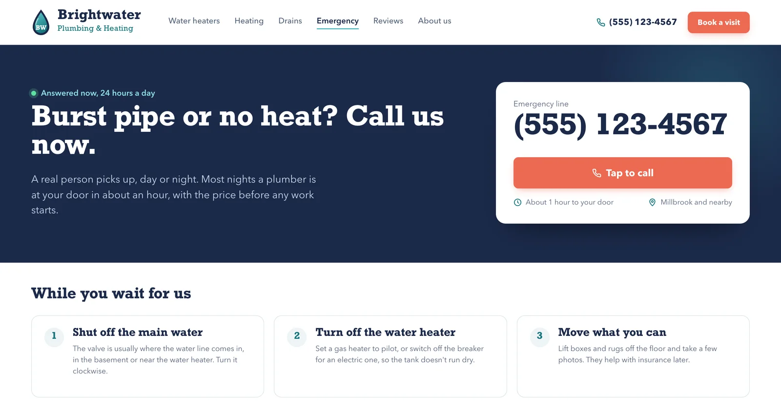
Give that next step a plain label. A vague “Get Started” button attracts clicks, then misleads people who wanted information first by dropping them into a sign-up flow, as NN/g found.3 “Book a consultation” or “Get a quote” says what happens. Pick one main step per page; your phone number can sit quietly beside it.
Test it: show your homepage on your phone for 10 seconds to someone who has never hired you, then take it back. Ask what you do, who it’s for, and what they’d tap next.
If it fails: rewrite the headline in the words clients use on the phone, say who it’s for beneath it, and relabel the button.
Can people reach you in one tap?
Plenty of people would rather call. Most of the 20 business professionals in a Nielsen Norman Group study said they preferred talking to a person on the phone to emailing, filling in a form or chatting.4 When it wasn’t urgent, or they couldn’t pick up the phone, they wrote instead. So make both easy.
Start with the phone number. It belongs at the top of every page, as a link that opens the dialer. On your own phone, tap it on three different pages. If nothing happens, the number is plain text, and whoever runs your site can make it a phone link (a “tel:” link).
Then the form, where every extra box is one more reason to stop. NN/g’s form guidelines put it bluntly: “Every time you cut a field or question from a form, you increase its conversion rate.”5 Most online checkouts need only 8 form fields, yet the average in 2024 had 11.3, by the count of Baymard Institute, which studies them.6 That’s research on shops; we found none on service businesses’ inquiry forms. Labels matter too: WebAIM’s 2026 scan of the top million home pages found unlabeled form fields on 51% of them, a barrier it counts as having “notable end user impact.”7
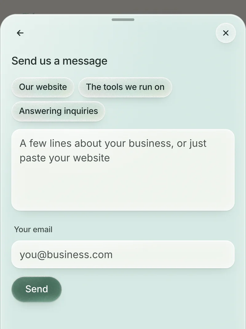
Now the one-thumb test: fill in your form on your phone, on mobile data, with one thumb. Count the fields, and check the message reached your inbox and stayed out of spam. Then run the page through WAVE, WebAIM’s free checker. For each field, ask whether you need it before the first conversation. A name, a way to reply and a line about what they need is often enough.
Then say when you’ll reply, and keep to it: NN/g found most people expect an answer to a form within 24 hours.4 For what “fast” really means, read how fast to reply to a new inquiry.
Is the proof where the doubt is?
People decide whether to trust you before they decide to get in touch. So show there’s a real organization and real people behind the site, and make your phone number, address and email clear. Stanford’s Guidelines for Web Credibility, drawn from research with more than 4,500 people, ask for exactly that.8
Closer to home, a small NN/g study watched people choosing cleaners and movers. They wanted photos of the work being done and who would do it; pictures of finished rooms alone were “more likely to be considered filler.” Every participant said they’d read reviews before hiring, and they trusted reviews on outside sites more than testimonials on the company’s own.9
So put proof beside the doubt: a real project photo next to the service it shows, a review with a full name next to the button, a link to your Google reviews. A stock photo of a handshake proves nothing about you.
Answer the questions people ask before they call. The same study found people want to know likely costs up front but hate filling in long forms to find out; NN/g says a price range is fine if the extras are clear. Movers who published packing tips came across as experts.9
The five-question test: write down the five questions you answer on most first calls, then find each answer on your site. To find more, open Performance and the Queries tab in Search Console, Google’s free report on your site in search, and read the words people searched before they landed.10
Every missing answer goes on the page where the question comes up, because that’s where the doubt is.
Is it fast on a phone?
Google’s bar for a good page: the main content appears within 2.5 seconds, a tap gets a response within 200 milliseconds, and nothing jumps as it loads.11 The evidence on what speed changes, mostly from large brands, is in what a redesign can and can’t do.
Test it: run your homepage and your main service page through PageSpeed Insights and read the mobile results. Read the real-visitor data from the last 28 days if it’s there; smaller sites may get only the simulated test.12
If it fails: start with the suggestions it lists under the scores. Shrinking oversized photos is often one you can do yourself.
Why won’t more traffic fix it?
Every new visitor lands on the same page. If it loses most of the people it gets, paying for twice the visitors buys twice the loss.
Do the sum with your own numbers: last month’s inquiries (forms, calls, emails) divided by last month’s visits.
- Where you are. Say 800 visits brought 8 inquiries. That’s 1 in 100.
- Buying traffic. Spend $400 on ads for 400 more visits, and at 1 in 100 you get 4 more inquiries. That’s $100 each.
- Fixing the page. If the fixes took the page to 2 in 100, the same 800 visits would bring 16 inquiries for nothing extra, and the same $400 would buy 8 more, at $50 each.
Inquiries in each case of the worked example. Where you are: 800 visits bring 8. Buying 400 more visits for $400: 8 plus 4. Fixing the page: the same 800 visits bring 16. Fixing the page, then buying the same 400 visits: 16 plus 8.
Put your own numbers in and the point holds at any size: fix the page first, and every visit you pay for afterwards is worth more. We’d fix the button before buying a single ad.
How do you know it’s working?
Count inquiries. More visitors with the same inquiries is the problem from the last section, only bigger. You already have free ways to count:
- Count forms in your inbox, or mark the form’s submission as a key event (Google Analytics’ name for an action worth counting).13
- For calls from Google, your Google Business Profile’s Performance view counts taps on its call button and its website link.14
- For calls from your site, ask each new caller how they found you, and keep a tally.
- For searches, Search Console shows the ones that bring people in, and how often they click.10
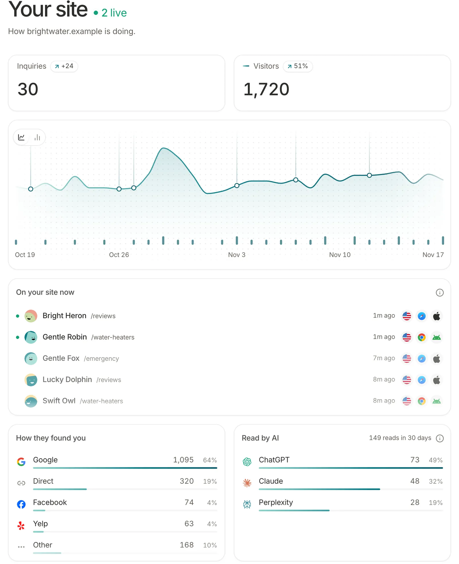
Change one thing at a time, and give each change a full month before you judge it. Compare that month with the one before and with the same month last year. If you get a few inquiries a week, a swing of two or three either way means nothing yet. Judge quality too: an inquiry you’d turn away doesn’t count.
Questions
What is a good conversion rate for a website?
There isn’t one worth aiming at. An average from other people’s sites, counting other things, tells you little about yours. Compare your site with itself, before and after each change.
Should I add a chatbot or a pop-up?
Only if it helps people who are already trying to reach you. NN/g’s advice is that chat should be available but not “popping up without the user initiating the interaction.”4 Our guide to whether you need a chatbot covers when one is worth it.
What if my site can’t be fixed in place?
Sometimes the problem is the structure, or a platform you can’t edit, and patching it costs more than it returns. If most of the tests above fail, read the signs your website needs a redesign before you spend on either.
Where we come in
Before anyone reaches out, they look you up. We design sites around that moment: what people want to know, what makes them hesitate, what gets them to write. After launch we keep looking after the site, so fixes like the ones on this page keep getting made, and the site is yours from day one, whoever looks after it.
If a template or a tool you already pay for would serve you better, that’s what we’ll tell you. Our comparisons show when each one wins.