
The short answer
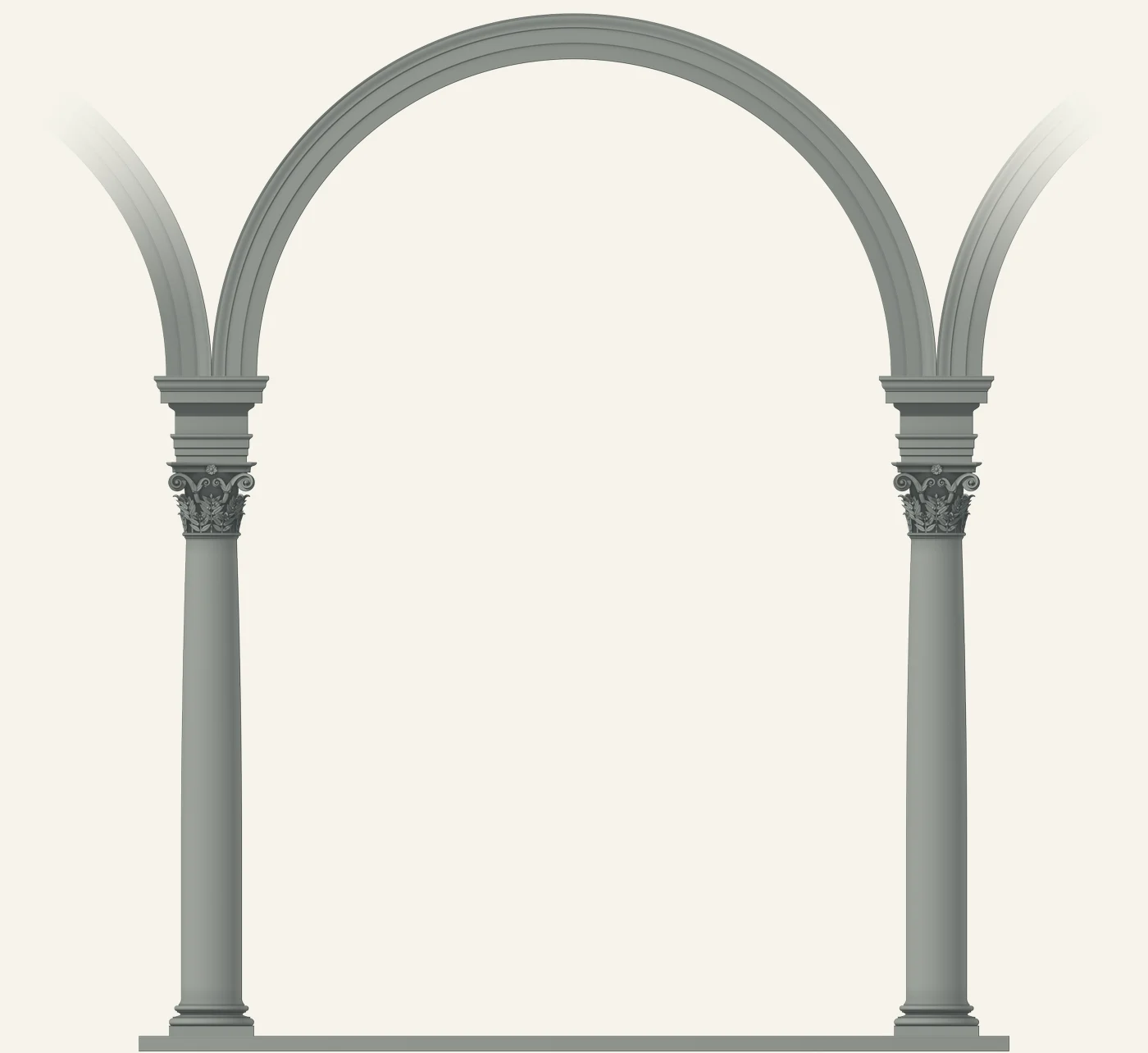
In code, from geometry, with no photographs. The arcade bay behind the opening of every article on this site takes its proportions from real buildings and old architecture books, and two figures drawn as buildings (an aqueduct with moving water and a ruined round temple) are drawn in code too. The twisted columns in our home page’s footer were modelled the same way, from the build of Bernini’s baldacchino in St Peter’s. The bay is rendered large and scaled to each size a screen needs, so it stays sharp in a file of 13 to 97 KB, and its wide-screen and phone versions match because they share one set of proportions and one light.
Why borrow proportions from real buildings?
Because the old rules already solve problems we would otherwise solve badly. The bay is one arch of a Brunelleschi arcade, after two of his buildings in Florence: the Ospedale degli Innocenti, a home for abandoned children founded by the silk merchants’ guild in 1419,1 and the church of Santo Spirito, built between 1444 and 1488.2
Every measurement sits in one table in the code, and each row names its source: Palladio for the column and capital, Vitruvius for the base,3 and an 1889 edition of Vignola’s Five Orders of Architecture for the top of the shaft.4 The column is nine and a half diameters tall, the capital a diameter and a sixth, both Palladio’s. The shafts are plain, as in both buildings.
We broke the rules in three places, each on purpose. The block above each capital is three quarters of Palladio’s height, because his full height overpowered the capital. The columns stand wider apart than the Innocenti’s, because at its spacing our headlines touched the stone. And the arch has two bands and a crown where the Innocenti has three, so it holds at small sizes.
The changes are for the visitor, who gets a frame that looks right without needing to know why, and words that stay at least 20 pixels off the stone on wider screens.
Why our laurel became an olive branch
Bernini designed the baldacchino, the canopy over St Peter’s tomb, in 1624, and it was finished in 1633. He chose twisted columns so it wouldn’t look too heavy.5 Branches of laurel, a Barberini family emblem, follow the spiral of each shaft.6
Our footer columns follow its build: three full turns, a lower third cut with 24 spiral grooves, and the right column twisting the opposite way to the left, as on the baldacchino’s front pair. The leaves are olive, because that’s our name. That part is our adaptation: Bernini used laurel.
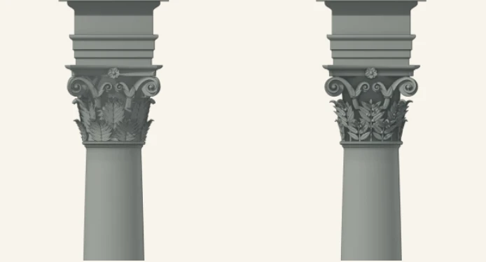
The bay makes the same swap. A Corinthian capital is carved with acanthus; ours carries olive sprays, slender leaves in pairs with olives at the forks.
Why draw it in code instead of exporting a picture?
Because the code is the drawing, and the picture is only its output. A small renderer we wrote, with no outside libraries, builds each part as solid geometry and lights it with one sun. Every tone comes from how the stone faces that light. There’s no photograph anywhere in it.
That pays off whenever something changes. The column is drawn once and set down twice, so both share one light instead of one being a mirror image. When phones needed their own bay, we set the columns 20 modules apart instead of 24 (a module here is half the column’s width at the foot) and rendered it again. With a photograph, that would have meant moving a building.
The price was a true vector file, the kind made of shapes that scales to any size. We traced the render into one, and its shading came out in steps, so we ship WebP pictures (a compact image format) made from the render: three sizes for wide screens and three for phones. The largest is 1,920 pixels tall, twice the tallest the bay is ever shown, so a visitor gets a sharp frame on any screen in one small file.
How the figures move, and how we check them
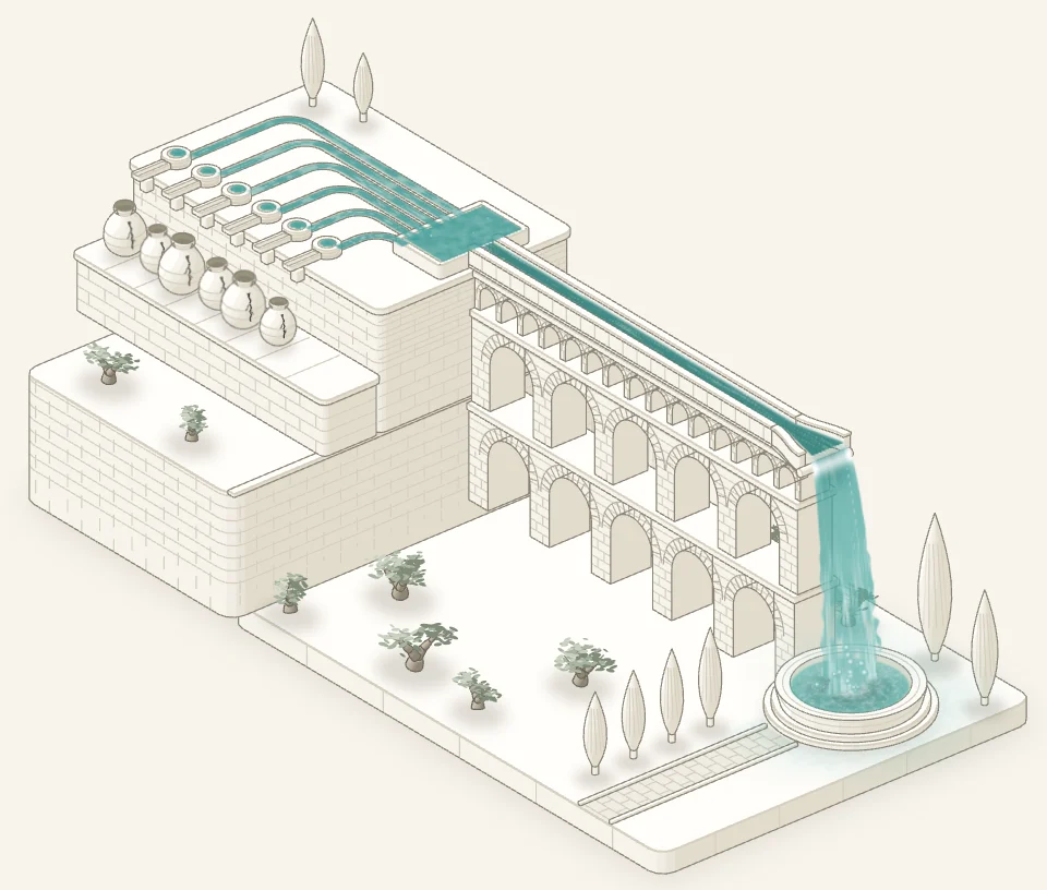
The aqueduct on our agency comparison page and the ruined temple on our about page are drawn in code too, in an isometric style, where parallel lines stay parallel. Each is one script: the line drawing plus a small program for the graphics chip (WebGL), set in the same camera.
In the aqueduct, that program paints only the water, fresh every frame from one clock. Streaks drift along the channel on top of three tiers of arches. Then the water falls as a glassy sheet that breaks into white strands, as wide as the flow feeding it: a thread for one spring, the full spillway for six. Spray arcs up, ripples ring out across the basin and mist rises. Nothing pops; each change eases in. It stops off screen, holds still if your device asks for less motion, and shows a still drawing without WebGL.
We score every figure against a written checklist before it ships: seven parts, from beauty to page health, each line scored 0 to 2 on fresh screenshots. A figure passes with no zeros, full marks on the lines marked as gates, and at least 85% overall. Our favourite line asks whether it could be built: every column stands on something and carries something, and nothing floats.
The numbers
File sizes and counts, measured in the site’s source on 17 November 2026. The figures are the heavy ones, which comes up again below.
What a visitor downloads. The bay for phones: 13 to 51 KB, by screen size. The bay for wide screens: 40 to 97 KB. The aqueduct figure: 170 KB with gzip, 861 KB as stored. The temple figure: 261 KB with gzip, 1,097 KB as stored.
| What | Number | What was measured |
|---|---|---|
| Bay for wide screens | 40, 68 and 97 KB | The three WebP files, 960, 1,440 and 1,920 pixels tall |
| Bay for phones | 13, 31 and 51 KB | The three WebP files, 390, 780 and 1,170 pixels wide |
| Aqueduct figure | 861 KB, or 170 KB with gzip | Its one script, as stored and compressed |
| Temple figure | 1,097 KB, or 261 KB with gzip | Its one script, as stored and compressed |
| Olive sprays around each capital | 16 | Two tiers of 8, as laid out in the proportions table |
| Footer column twist | 3 turns, 24 grooves | Values in the column’s code |
| Figure checklist | 7 parts, 29 lines | Counted in the written checklist |
Why it matters for your site
A visitor should never need to know any of this. They’d only notice it done badly: a headline touching the stone, a blurred arch on a new phone, a page that jumps as it loads. We give a client’s site the same attention. We design it and build it ourselves, and after launch we keep looking after it and making it better.
Under the hood
From proportions to the file a browser loads:
- The proportions live in one table, in modules (half the column’s width at the foot), each row with its source.
- Code builds each part as solid geometry. The base and shaft are turned from their profiles, like wood on a lathe; each leaf of the capital is its own part, so a nearer leaf hides the lines of one behind.
- One light, at 45 degrees from the upper left, the classical rule for drawing shadows.
- Tone is worked out per pixel at about four to eight times the size of the largest file, then filtered down.
- The column is set down twice, the arch goes up, and the side arches fade into the paper.
- The result is saved as WebP at 960, 1,440 and 1,920 pixels tall, and the page lists all three with srcset, a web standard that lets the browser pick the size its screen needs.
Two things we’d do differently. We’d draw for the phone first: when the bay went live on 1 November it was hidden on screens under 768 pixels wide, and phones only got their own version on 17 November. And we’d give the figures a weight budget before drawing them. They came out at 861 KB and 1.1 MB, and loading each one only as you scroll near came afterwards, as a fix. A weight budget is a proportions table for the file, and like Palladio’s, it belongs at the start.
Questions
Doesn’t detail like this slow a site down?
The bay barely does: the file your screen gets is 13 to 97 KB. The figures are heavier, 170 and 261 KB with gzip, so each one waits until it’s within 900 pixels of the screen before it loads, and the page keeps its space so nothing jumps.
Why not use a photograph of a real arcade?
A photograph brings its own light, angle and background. Ours stands on the page with nothing behind it, both columns under one light, and it can be rendered again when a layout changes, as it was for phones.